
Trust Is Visual Before It’s Verbal

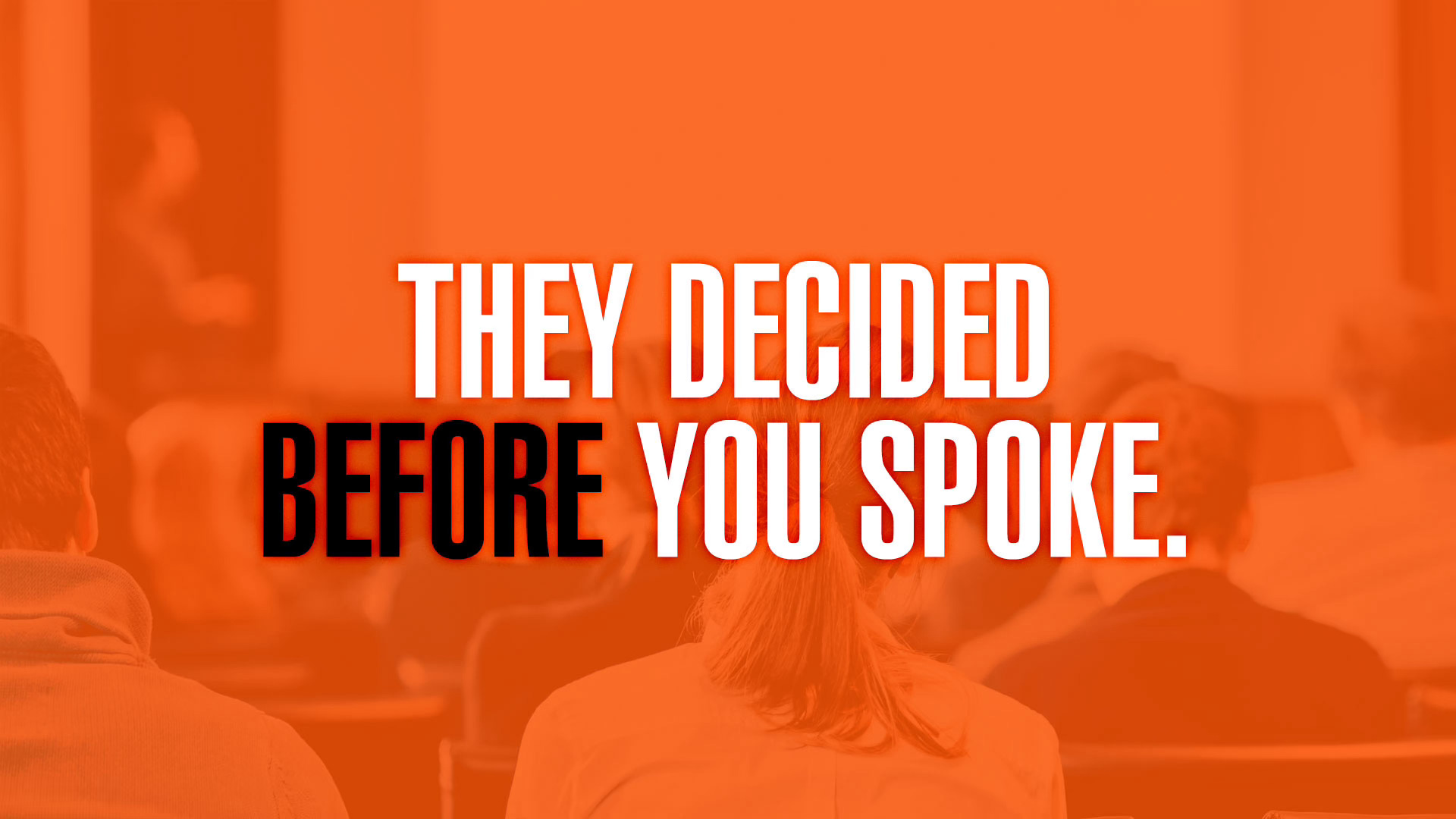
Nobody says this out loud, but your deck already told them what to think.
Before the meeting.
Before the handshake.
Before the first “So tell us about what you do.”
You can feel it when it happens. The energy in the room is already set. People nod a little faster. Questions get sharper. Or worse, polite. And once that tone is set, you’re not changing it with better talking.
This is about trust. And trust shows up visually first.
If you work in sports marketing or media, this probably hits close to home. You’re selling something that requires belief… partnerships, sponsorships, long-term value. Nobody buys that on logic alone. They decide if you’re credible before you ever explain yourself.
Decision-makers decide early. Not because they’re careless, but because they’re busy. They’ve seen hundreds of decks. Thousands of slides. They’ve learned to read signals fast.
Your materials are full of those signals.
The problem isn’t that your strategy is weak. Most teams we meet have solid ideas. The problem is that the work looks uncertain. Inconsistent type. Logos that shift size slide to slide. Colors that feel improvised. Layouts that change tone halfway through. None of that sounds fatal on its own. Together, it sends a message you never intended: “We’re still figuring this out.”
And here’s the part that stings a little: people assume that’s how you’ll handle their brand, too.
The lead isn’t more clever messaging. It’s visual control. When your materials feel steady, confident, and intentional, people relax. They stop wondering if you’re ready. They start listening.
A common mistake teams make is treating decks like disposable tools. Something you rush before a meeting. Something you’ll “clean up later.” That mindset leaks. You can hear it in the room when someone says, “This is just a draft.” You may think that lowers the bar. It actually raises suspicion.
What you want (and everyone wants) is for partners to trust you faster. To feel like, “These people know what they’re doing.” To picture their logo next to yours without flinching. To believe you’ll make them look smart internally.
That doesn’t happen because of one great slide. It happens because of quiet consistency.
There are a handful of visual signals that do most of the work:
Consistent structure… slides feel related, not reinvented.
Clear hierarchy, I know where to look first without thinking.
Brand restraint, not everything is shouting.
Real examples, or very credible mockups.
Space to breathe, confidence leaves room.
None of this is flashy, and that’s the point.
The lesson is simple, even if it’s uncomfortable: you’re being judged on things you didn’t think were the point. Not your ideas, but your readiness.
You might be thinking, “But our partners care about results, not fonts.”
Sure. And they also care about risk. Visual chaos feels like risk. Visual clarity feels like control.
Here’s how to use this without overhauling everything. Start small. Lock a core layout and stop improvising. Decide how partner logos live in your world, and don’t change them every time. Treat your deck like a system, not a file. Something reusable. Something that helps non-marketers sound polished without trying.
That’s how trust sneaks in early.
So here’s the indirect question worth sitting with: what are your materials quietly saying about you before you ever speak?
If you want a second set of eyes on what your deck is already communicating, or you’re tired of rebuilding the same slides from scratch, let’s talk. Not necessarily to make things prettier, but to make trust easier.